

This is the second page of my SIGGRAPH report -- the beginning of the report including the table of contents is here.
This was probably my favorite sketch of the conference. It's pretty much another example of "new tricks for old dogs" in that it revisits how to do wireframe rendering. It was by J. Andreas Bærentzen from the Danmarks Tekniske Universitet; his email address is DAB (at) imm.olto.dk. I wish I had some of his screen captures, the ease with which this technique can produce sophisticated wireframe rendering is impressive.
What's Wrong with How We Do Wireframe Rendering Now?
In general, the way we do wireframe-on-shaded rendering now is:
In summary, current methods:
Our method
This whole technique works just as well for quads as triangles.
Performance is excellent on consumer graphics cards (on professional cards, the current offest method are already very fast, so there's so particular speed difference).
The other huge advantage of this method is that because the color is being calculated on the fragment shader, it's trivial to produce anti-aliased lines (in fact, it typically has no performance affect to use a color ramp in the fragment shader and get anti-aliasing).
In D3D10, we should get geometry shaders which will allow for generating alternate geometry. That should allow a host of other effects to be combined into this, such as enhancing silhouette edges by checking for front/back edges in the geometry shader.
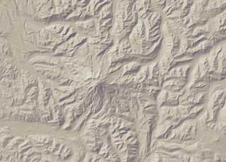
This was a paper from Princeton about a series of shading techniques all designed to reproduce some of the effects of hand-shaded relief illustrations, such as hand-drawn topographic maps. The complete paper is available at http://www.cs.princeton.edu/gfx/pubs/Rusinkiewicz_2006_ESF/index.php. Although their software (which you can download) is non-real-time, if you precomputed the smoothed normals it looks like the rest of the technique would be perfectly feasible in real-time.
 |
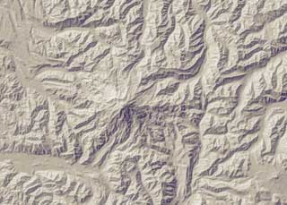 |
| Above: standard diffuse rendering of a terrain mesh (images from author's samples on website at Princeton). | Above: rendering using the Exaggerated Shading technique described in the paper. |
Elements of Hand-Shaded Relief
Goals of this Research
Basic steps of Exaggerated Shading
1. Increased Local Contrast
2. Adjust Light Direction
3. Multiscale Computation
User Controls
 |
 |
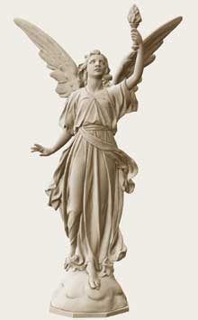 |
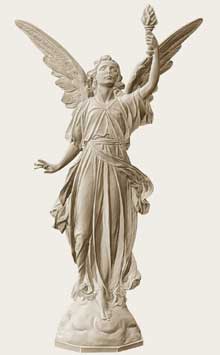
| At left, a standard diffuse rendering of the scanned dataset for this statue. Surface details are quite hard to see. In the middle is the same exaggerated rendering as the terrain above; surface details are now nicely visible, but the overall 3D shape of the statue is harder to see. At right, a different set of user parameters gives a rendering with more visual interest and surface detail then the diffuse rendering, but which still expresses the 3D shape of the statue. All images by the author from the samples on the website. | ||
This paper absolutely wins for the simplest idea of any paper. In order to make imagery where the objects are more readily visible, take the Z buffer and apply the unsharp mask operation to it (unsharp mask is simply subtracting a gaussian blurred version of the image from the original). Now, in either the negative or positive areas of the unsharp mask, apply darkening or lightening to the original image. Result: much better definition of objects near depth discontinuities. I think half the people with laptops in the audience were typing in the code during the paper; it's truly a trivial technique to implement.
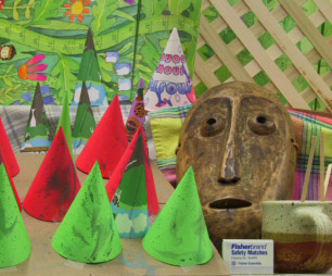
Example #1: photograph with depth information (their technique can be used with either CG imagery, or photographs with range information):
 |
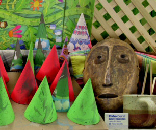 |
Above left: the original photograph. Above right: the enhanced photograph.
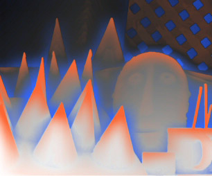
At right: the result of applying unsharp mask to the depth buffer. Orange
areas are closer areas that are near farther areas; blue areas are far
areas that are near closer area. In this case, the enhancement was to darken
blue areas. All images copyright the authors from their
website. |
 |
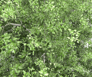
Example #2: CG foliage
 |
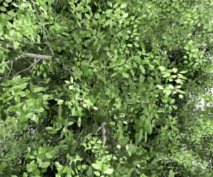 |
| Original at left, enhanced at right. This is the same enhancement as the first example; the blue (negative) areas of the unsharp-masked-buffer have been darkened. | |
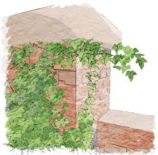
Example #3: From a Non-photorealistic Rendering Pipeline
 |
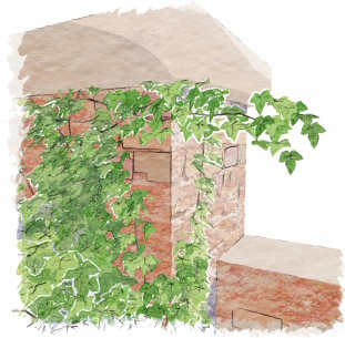 |
| Here, the enhancement was to clear the areas represented by the blue (negative) portion of the unsharp-masked-depth-buffer, thus allowing the white background to show through. | |
This is one of those cases where if someone had told me what they were trying to do, even though it's a strictly 2D problem, I would have said it wasn't going to work. Right up until the moment they show the result. It's more proof that any sufficiently advanced technology is indistinguishable from magic!
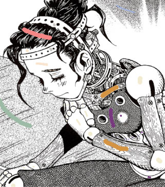
Their system from the Chinese University of Hong Kong is attempting to colorize Japanese manga, the traditionally black-and-white, pattern-intensive comics that are ubiquitous in Japan and popular throughout Asia and increasingly around the world. Although the Japanese market is very used to black-and-white comics, in many other countries it would be desirable to colorize the manga. Unfortunately, as with much scanned hand-drawn, zipatone-intensive art, traditional flood-filling techniques work very poorly with manga; there are far too many gaps in the lines, and frequently identically patterned areas are not contiguous.
Well, they got it to work.
 |
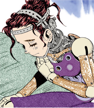 |
| At left: the original scanned panel from the Shuueisha manga, with the small marks the user has made in the system to indicate a color for each patterned region. Note that in most of the cases, only one of many disjoint similarly-patterned regions need be marked, e.g., only one of the wooden arm sections was marked by the user. At right: the system runs and produces this colorized result. All images by the authors; the paper is available here. | |
The system definitely shows that, in the 2D problem domain, you can afford to apply a lot of computational power to a problem nowadays. There are a few pieces of the technique that work together to make a powerful system:
It was an impressive piece of work on this very specialized problem domain.
The last paper of the conference (traditionally meaning the papers committee thought it was so good people would stick around to see it) was this paper from Northwestern on real-time video abstraction (as with most academic papers, they have a generous definition of real-time; the system ran at 10fps on 640x480 resolution images on a GeForce 7800 GTX).
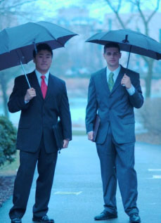 |
At left: the original input image. At right: the abstract, quantized version from this paper. The paper and some demonstration videos are all online here. | 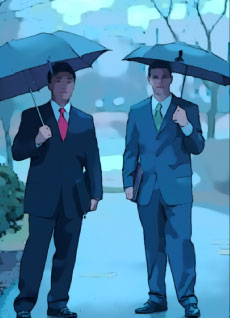 |
The paper was trying to automatically produce abstract, posterized images from a video stream. As anyone who's ever tried this (or anyone who's sat through the movies Waking Life or A Scanner Darkly, both produced with Bob Sabiston's software for non-real-time abstraction) knows, the whole challenge of this area is getting good temporal coherence between frames. It's easy to try and produce a "simplified" image, and actually get one that looks good in stills -- but then introduces so much temporal noise in motion that the results is busier than the original video.
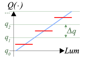 |
The results in their movies (see their website for the examples) work much better than most of the prior attempts I've seen. I think the basic reason that's true has to do with how they quantize their data. Normally, quantization looks like the graph at left: The input signal (in blue) is quantized to one of the output levels (shown in red). |
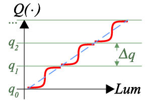 |
However, in this paper, they don't actually fully quantize the signal. Instead, they divide it into bands and map the value through a tanh function within each band. This means that although the results do become mostly quantized and simplied, the output is actually a continuous rather than discrete function of the input. I think that's why their results look so much more temporally coherent. They use this trick both in their quantization of luminance and in their edge-finding. |
458nm (Electronic Theater) |
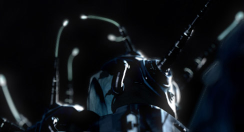 |
| This film won the Jury Prize at the SIGGRAPH Electronic Theater (as well as the Golden Nica at Prix Ars Electronica), which I think was well-deserved. That said, it's not a very conventional film. In fact, while there's a two-word phrase* that memorably recalls the film for everyone who saw it, that really doesn't tell you anything about why it's so worth watching. I will say that it starts out seeming very trite ("oh my, another group of CG filmmakers in love with their machinery") but it's headed somewhere very different indeed. | Unfortunately, because the film is being actively shown at film festivals, it isn't possible to see it online now AFAIK. It is on the Electronic Theater DVD, though, and there's also a trailer available on the 458nm website. * "snail sex", if you must know |
Carlitopolis (Electronic Theater)Carlitopolis was an awesome PhD project by a self-described "perversionist" artist from the ENSAD art academy in Paris. It plays very actively with what is real and what is fake in a way that's both amusing and thought-provoking. The movie is on the SIGGRAPH DVD but not (AFAIK) online anywhere. |
|
Just a quick hat's off to ILM for showing everybody else how a SIGGRAPH show reel should be done. While the work they showed off was par for the course for their excellent effects, they framed it intelligently and focused on the work being done rather than trying to market the movie -- quite different from the terrible piece about the film Open Season which unfortunately was in the ET also.
There were two really, really funny beer commercials in the show this year. Sometimes it's irritating when the show is too focused on that, but these were well worth it. One was called "Big Ad" for Carlton Draught (an Aussie beer), it's available online on YouTube. Not surprisingly, so is the other awesome ad, called "noitulovE", for Guiness.